I really enjoy this poster, and the work of Yaakov Agam in general.
Continue reading
Postacrds posts
Poster Collection – 2 – AGAM
Posted in Postacrds
A year in the doing
I really wanted to start this post with “well…” – but I thought that would be a little to predictable. But that’s what things feel like. 1 year has passed since I blogged anything of note – and my how time goes by! Last time I shouted into the interweb void I was busy trying to learn AS3, attempting to document my poster collection, building coffee tables, and reflecting on my interactions with the world. So what happened? Why the long absence? Well, nothing really – I haven’t been absent per se, more occupied.
Continue reading
Posted in Postacrds
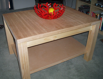
The new Coffee Table
So, what to do when your presented with a week off? You could spend time catching up on the InterWebs, you could try and reply to all those emails asking you to buy Viagra or rescue some Nigerian Prince from the global credit crunch… or you could do something rewarding and totally offline. I chose the latter (something I’m doing more and more these days when I can get away with it ![]() )
)
Yup, nothing Ikea about this puppy – not a single allen key was harmed making this coffee table! Unfortunately I didn’t have the presence of mind to take shots as I was building it, so you’ll just have to take my word.
Materials
The top is actually an offcut from a solid-core fire rated maple door. Very heavy, but has an excellent grain. I (with some help from my step father Roger), had to repair one end of the offcut, filling it with a spare piece of maple trimming – because the internal cavety of the door is filled with particle board which looks butt ugly!
The shelf is another spare piece of MDF that Rog had lying around, with the rest of the table made out of pine (the legs were bought from Bunnings for 20 bucks each). Because of the design, each leg needed to have mortiose joints to accomodate the shelf, and rebates cut at the top for the tabletop brackets.
The bracket was attached to the top using liquid nails, and allowed to set. Then the legs were arranged, and the shelf supports carefully inserted into their mortises, and again everything was set with liquid nails – legs to brackets and top, shelf supports to mortoise joints. As everything was setting, the legs were then nailed to the bracket and top using a nail gun. The shelf was added last, much like a puzzle piece. It isn’t fixed to the supports, but is rather a snug fitting piece.
It still needs to be stained, but I’m just waiting for the timber colours to go off, but we are considering something dark with a hint of red. Maybe a Jarrah or similar.
Tools
- Nail gun
- Plane
- Drop saw
- Panel hacksaw
- Clamps
- Liquid Nails
- Triton workbench
- Chisel
Cost
- Time -Approx 12 hours (including beer-stops)
- Materials – Approx $50 plus offcuts
Oh, and for those interested, the wonderful fruit bowl shown on the top of the coffee table was given as a wedding present by the folks at Redant, and is by Italian designers Alessi.
Posted in Postacrds
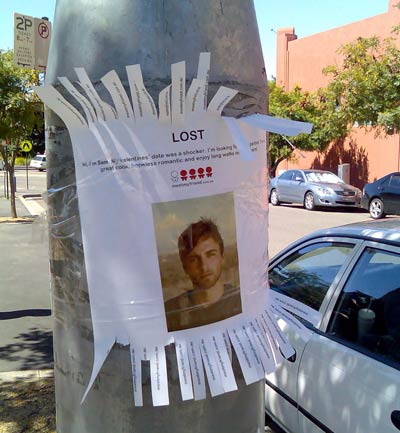
Clever, but tasteless…
Found around the Pyrmont area, these Lost signs are actually subversive advertising for the new dating website Meet My Friend.
And while it certainly catches your eye (which I guess is the whole point), it stretches the friendship when you realise that it’s not some poor sod whose gone missing, but some start-up looking for clients. It seems I’m not the only one who feels this way either.
Reaction
It’s the name of the game I guess. Illicit a reaction from the viewer, in the hope that they will tell their friends what they saw. Increase brand awareness at minimal cost. Viralness. And if you look it at it from that point of view, it certainly works. After all, im blogging about it, so it got me talking/thinking/reacting didn’t it?
However, beside the fact im married, this kind of advertising would not lead me to actually use the service. If this kind of guerrilla campaign turns people 50/50, then id be in the camp that get turned away, not towards. My 2 cents.
Posted in Postacrds
Earth Hour
At work we just went live with a project for Earth Hour, which began it’s life in Sydney as a 1 hour event where everyone turns their lights off – including big business. Well, this year, it’s going global. Spread the word!
For those interested in the technology, we used RoR and Radiant.
Posted in Postacrds
Wedding Day Gallery
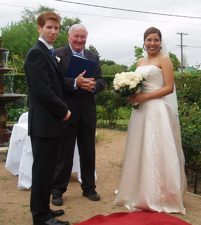
OK, so I’ve been a little slack of late (try the last 6 months!!) posting anything not related to my personal life… and indeed it’s something i’ll try and remedy, but in the mean time, here’s a link to some photos of my big day (can you believe it’s nearly 6 weeks ago?!). This is by no means a complete set of photos, and if anyone out there has more and would like to share them with me, please drop me a line.
October 6, 2007. Daniel & Ailin’s Wedding Day
Footnote, For those interested in the technology, I’ve used the awesomely simple Simple Viewer to handle the preview – I would have made my own, but time is a premium at the moment. If you plan on using it yourself, the only thing to remember is to not have too many photos in the one gallery. At least in the free version it will try and load them all up into memory.
That is all.
Posted in Postacrds
Kia Ora from (sometimes) sunny Paihia
Hey all, well we have been in NZ now for 4 days, and we are nearly completely relaxed!
We spent the first night in New Zealand in the Langham Hotel in Auckland – swanky to say the least. Bath robes were the order of the day, and later in the evening we headed out to High St for a beatiful dinner at Vivace. Prices were more expensive than we’d anticipated, but my lamb shanks were the envy of everyone! They practically melted in your mouth. Delicious!
We spent a third of the second day driving to Paihia, located in the Bay of Islands, along the top north east coast of the north island. The drive was at times windy and sub-tropical, but Ailin is a fantastic driver and we arrived (after a few detours) to our resort ready to relax.
And you know you are on holidays when the biggest decision of each day is what time you will head down to the restaurant for breakfast, whether lunch will include one wine or two, and where to have dinner ![]()
Today (thursday… we think) we went to a Glow Worm cave in Waiomio, just a half hour drive south of Paihia, which is home to about 12,000 tiny bright spots of light. At times they were so close you could touch them, although this of course is strictly forbidden ![]() We also went to the famouse Kawakawa toilet block designed by Friedensreich Hundertwasser. A very creative loo… it moved Ailin in very special ways!!!
We also went to the famouse Kawakawa toilet block designed by Friedensreich Hundertwasser. A very creative loo… it moved Ailin in very special ways!!!
Anyway, tomorrow is our spa treatment and then on Saturday we will head a bit further north to discover something else… who knows what, but it will be fun finding out!!
Photos to come when we get home.
Ailin & Dan
(ps, the Global Gossip here isn’t using our designs yet – at least not all of them!!)
Posted in Postacrds
Interactive billboard
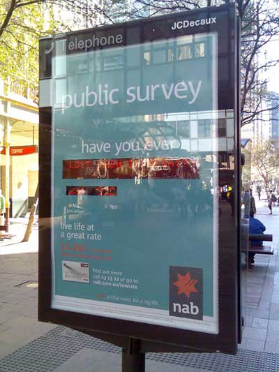
This is something I’ve not seen before, at least not in Sydney. In Pitt St Mall, NAB (a bank in Australia) have erected a billboard on the back of a public telephone, that invites users to interact with it.
I probably paid closer attention to it than I usually would, as one of my colleagues at work is currently completing his final semester at UTS, and his project (titled Poster 2.0), while not necessarily directed at the advertising industry, certainly touches (boom boom) on the concept of display systems that are designed specifically to be interacted with. From that point of view, I was intrigued to see how others in the mall would deal with this very unassuming interactive piece.
The premise
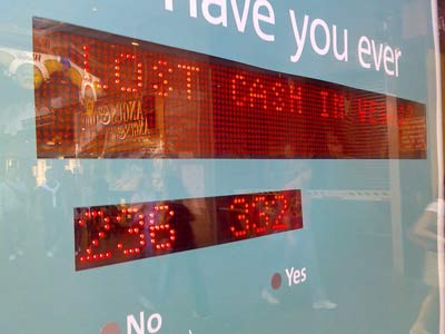
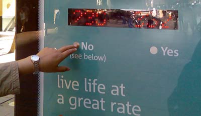
The billboard is setup like a public survey. There is an area where a yes/no question is put to the public, a tally is displayed, and interactin sought (vvia a simple yes/no touch device below). The results are displayed instantly, and the tag-line is “Live life at a great rate.”
Observations
I watched as several people took at least a minute or two to come to grips with the concept. More than half didn’t get it – that is, they stared, waiting for something to change. Obviously the invite wasn’t clear enough for them. One guy did eventually pluck up the courage to engage, and as soon as he chose “Yes” to the question “Have you ever lost money in Vegas”, the billboard updated the count, and he had a bit of a chuckle, and walked off. Result? Not sure…
Opinion
I don’t completely understand the communication of the Billboard. Take for example the following : “Have you ever lost money in Vegas : No (see below).” And then below : “Live life at a great rate.” Is this suggesting that only those people who haven’t lost money before are the ones that NAB want as customers? (The yes’s were more than the no’s when I was there…) I also wonder how much effort is going into placing and maintaining this billboard, vs how much actual new customers NAB are actually going to get. Perhaps, though, this is not the purpose of this sort of interface – is it’s job is merely to engage?
I did enjoy the subtlety of the display however – it didn’t initially jump out and grab you, it made you look twice, and even made you try and understand it – that sort of brand time is definitely worth something, though I don’t know how you quantify it.
Anyway, interesting regardless – and I think something that will become more and more common given time.
Posted in Postacrds
