In the past 12 months, many things have happened. The world has seen an unprecendented global shakedown of financial services, America welcomed in a black president, a well respected and seasoned newspaper filed for bankrupcy, and the catch phrase “chk chk boom!” entered the Australian vocabulary. Just to name a few. And every one of the events of the past 12 months has been recorded, distributed, discussed and discovered on the interwebs.
Continue reading
Viral posts
Communication Convergence
Posted in Thoughts
Clever, but tasteless…
Found around the Pyrmont area, these Lost signs are actually subversive advertising for the new dating website Meet My Friend.
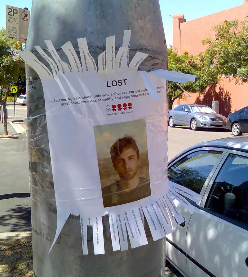
And while it certainly catches your eye (which I guess is the whole point), it stretches the friendship when you realise that it’s not some poor sod whose gone missing, but some start-up looking for clients. It seems I’m not the only one who feels this way either.
Reaction
It’s the name of the game I guess. Illicit a reaction from the viewer, in the hope that they will tell their friends what they saw. Increase brand awareness at minimal cost. Viralness. And if you look it at it from that point of view, it certainly works. After all, im blogging about it, so it got me talking/thinking/reacting didn’t it?
However, beside the fact im married, this kind of advertising would not lead me to actually use the service. If this kind of guerrilla campaign turns people 50/50, then id be in the camp that get turned away, not towards. My 2 cents.
Posted in Postacrds
Interactive billboard
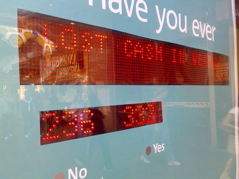
This is something I’ve not seen before, at least not in Sydney. In Pitt St Mall, NAB (a bank in Australia) have erected a billboard on the back of a public telephone, that invites users to interact with it.

I probably paid closer attention to it than I usually would, as one of my colleagues at work is currently completing his final semester at UTS, and his project (titled Poster 2.0), while not necessarily directed at the advertising industry, certainly touches (boom boom) on the concept of display systems that are designed specifically to be interacted with. From that point of view, I was intrigued to see how others in the mall would deal with this very unassuming interactive piece.
The premise
The billboard is setup like a public survey. There is an area where a yes/no question is put to the public, a tally is displayed, and interactin sought (vvia a simple yes/no touch device below). The results are displayed instantly, and the tag-line is “Live life at a great rate.”
Observations
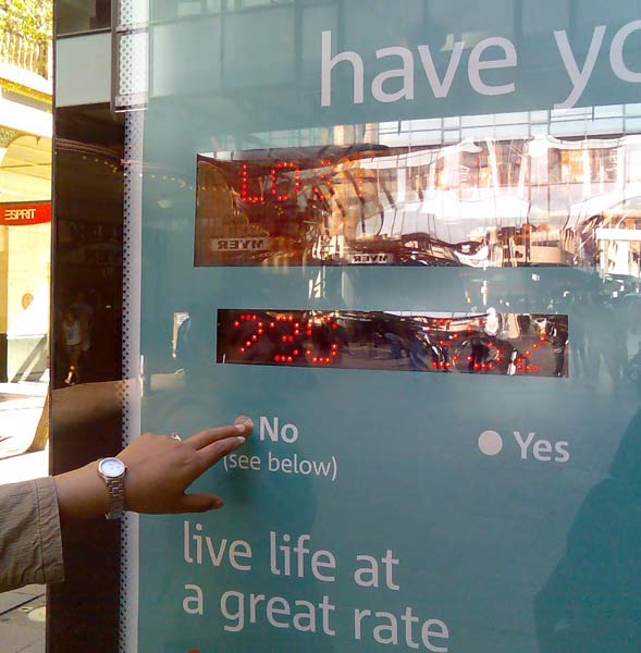
I watched as several people took at least a minute or two to come to grips with the concept. More than half didn’t get it – that is, they stared, waiting for something to change. Obviously the invite wasn’t clear enough for them. One guy did eventually pluck up the courage to engage, and as soon as he chose “Yes” to the question “Have you ever lost money in Vegas”, the billboard updated the count, and he had a bit of a chuckle, and walked off. Result? Not sure…
Opinion
I don’t completely understand the communication of the Billboard. Take for example the following : “Have you ever lost money in Vegas : No (see below).” And then below : “Live life at a great rate.” Is this suggesting that only those people who haven’t lost money before are the ones that NAB want as customers? (The yes’s were more than the no’s when I was there…) I also wonder how much effort is going into placing and maintaining this billboard, vs how much actual new customers NAB are actually going to get. Perhaps, though, this is not the purpose of this sort of interface – is it’s job is merely to engage?
I did enjoy the subtlety of the display however – it didn’t initially jump out and grab you, it made you look twice, and even made you try and understand it – that sort of brand time is definitely worth something, though I don’t know how you quantify it.
Anyway, interesting regardless – and I think something that will become more and more common given time.
Posted in Postacrds
Accessibility not an option
I visited the Australian goverment website promoting Australia Day 2007 yesterday, and what I saw kind of made me question if Accessibility is still an issue anymore…
You see, as far as I understood it, if a site was created by the government and for the people, it needed to be accessible by everyone. First thing that strikes me when I hit the site is that it’s made entirely with Flash. Now, this doesn’t necessarily mean it isn’t accessible, but being the inquisitive sprite that I am, I gave it a go with the ol’ keyboard… and… well, nothing.
Nope, not a thing. No little yellow highlight boxes around active areas, no link for an alternative version of the content…. nothing. For those that don’t know, Flash movies can be navigated using the keyboard, and any hotspots or buttons , when tabbed to, will get a big yellow highlight box around them.
Now, i’m not suggesting that I am the guru of accessibility – I don’t even know if the shifty homepage can be navigated with your keyboard (Edit – it can be… as long as you first click somewhere on the Flash movie. In IE7, you don’t even need to do that. Just tab away!) – but one would assume that a government website would stick to its own rules. Especially given that even SOCOG was sued back in the day…
Ive done my fair share of government web work, and if sweated blood to make the most intricate of Flash animations accessible for as many people as possible – sometimes because it’s the law, and other times because it’s a nice thing to do. And in the long run, this Australia Day site is not the most important site in the world… but when a site is so blatantly a government-based website… the least they could do would be to hold the flag for the rest of us and set an example of how to do it properly.
Addition : Just read a post over at Quirksmode, and it seems that the Dutch Government are getting strict on accessibility… lets see if it’s all talk or if they are serious about it.
Posted in Interaction