Yesterday I had the pleasure of spending time in several bookshops, just browsing. One of the stores I visited was Kinokuniya, in George St. It’s a great store (if at times a little over-priced), with a huge range of books. But because the shop is so large, they try and help shoppers with a touch-screen kiosk that searches for your book, and prints out a map of where the book is located (if it’s in stock).
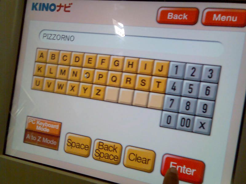
As you can see, it’s a very simple interface. In fact, this is the second screen. The first screen lets you choose what items you want to search on, author name, book title, etc. And the results are very accurate. But this screen in particular, while it may look simple enough, it’s perhaps a little too simple. Why?
QWERTY
Yes, Qwerty layouts might not be as optimised for performance as Dvorak’s, but it’s what we know.
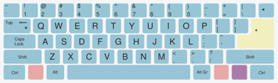
Image courtesy of Wikipedia
I put it to you, that when presented with a keyboard-esque layout for entering text, our brains, which are now so used to the standard qwerty layout, have great difficulty swapping to the unrelated visual order of the Kinokuniya interface. Sure, it’s simple, but it’s been overly simplified.
Did I miss something?
Funny enough the thing I missed – which you might have on first glance as well – is the button “PC Keyboard mode”. Sorry, but im not using this kiosk to set my personalised options – there is no ubicomp going on here, I just want to search for a book. So as far as im concerned, my brain is like “this button doesnt even exist”. Especially when im standing on an angle to the screen, AND my focus is on the keyboard, and not in the bottom right corner.
While the time difference between using Qwerty or not wouldn’t be measured even in minutes, it just bugs me they dont use Qwerty by default, AND that I have to choose to use it. I dont want to have to learn another layout. Ive already got to deal with mobile phones, pda, dvd’s, security locks… my brain just wants to enjoy the browsing experience. I want to find a book.
iPhone
Interestingly, I initially had the same reaction (but for different reasons) to the use of the Qwerty layout on the iPhone.
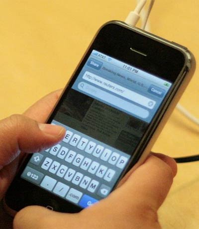
Image courtesy of Wikipedia
After using Nokia mobile devices for such a long time, with their predictive text and limited 12 button interface, I thought that using the qwerty layout for sms was too complicated, and perhaps it is (I haven’t had a chance to really play with the SMS capabilities of the iPhone – not having one of my own!!), but at least Apple didn’t attempt to come up with a new layout.
Conclusion
The Kinokuniya kiosk may be helpful, but from an interface design point of view, I find it ignores the user and their use-case. It is (for want of a better term) undesigned. And although undesign can be found everywhere and is a legitimate approach to interface design, ignore the user at your own peril!