In the past 12 months, many things have happened. The world has seen an unprecendented global shakedown of financial services, America welcomed in a black president, a well respected and seasoned newspaper filed for bankrupcy, and the catch phrase “chk chk boom!” entered the Australian vocabulary. Just to name a few. And every one of the events of the past 12 months has been recorded, distributed, discussed and discovered on the interwebs.
Continue reading
ubicomp posts
Communication Convergence
Posted in Thoughts
Interactive billboard
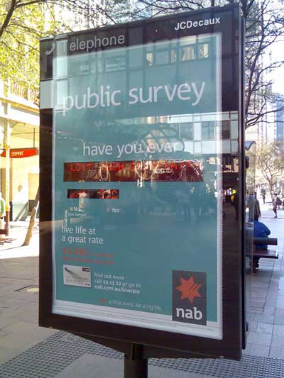
This is something I’ve not seen before, at least not in Sydney. In Pitt St Mall, NAB (a bank in Australia) have erected a billboard on the back of a public telephone, that invites users to interact with it.
I probably paid closer attention to it than I usually would, as one of my colleagues at work is currently completing his final semester at UTS, and his project (titled Poster 2.0), while not necessarily directed at the advertising industry, certainly touches (boom boom) on the concept of display systems that are designed specifically to be interacted with. From that point of view, I was intrigued to see how others in the mall would deal with this very unassuming interactive piece.
The premise
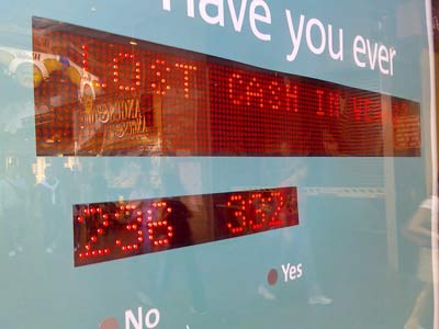
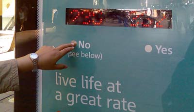
The billboard is setup like a public survey. There is an area where a yes/no question is put to the public, a tally is displayed, and interactin sought (vvia a simple yes/no touch device below). The results are displayed instantly, and the tag-line is “Live life at a great rate.”
Observations
I watched as several people took at least a minute or two to come to grips with the concept. More than half didn’t get it – that is, they stared, waiting for something to change. Obviously the invite wasn’t clear enough for them. One guy did eventually pluck up the courage to engage, and as soon as he chose “Yes” to the question “Have you ever lost money in Vegas”, the billboard updated the count, and he had a bit of a chuckle, and walked off. Result? Not sure…
Opinion
I don’t completely understand the communication of the Billboard. Take for example the following : “Have you ever lost money in Vegas : No (see below).” And then below : “Live life at a great rate.” Is this suggesting that only those people who haven’t lost money before are the ones that NAB want as customers? (The yes’s were more than the no’s when I was there…) I also wonder how much effort is going into placing and maintaining this billboard, vs how much actual new customers NAB are actually going to get. Perhaps, though, this is not the purpose of this sort of interface – is it’s job is merely to engage?
I did enjoy the subtlety of the display however – it didn’t initially jump out and grab you, it made you look twice, and even made you try and understand it – that sort of brand time is definitely worth something, though I don’t know how you quantify it.
Anyway, interesting regardless – and I think something that will become more and more common given time.
Posted in Postacrds
maps.google.com.au
Ahhh, my life is now complete… now I can search for coffee shops in Sussex St without leaving the office! That will make life soo much easier ![]()
Seriously though (as I remove my tongue from my cheek), I feel like we are getting to some kind of mapping nirvana, a synergy of place that didn’t previously exist. I wonder how long until Google release a print version to rival the UBD.
Then again, I wonder how long until the mobile version of Google Maps is fast and intuitive enough to be a better option that opening the UBD whilst you are actually sitting in your car…
Posted in Development


