SWF and UFO holding hands

The popular Flash javascript embed techniques SWFObject and UFO have joined forces to create SWFFix. Still in it’s alpha stage, this is a development to keep an eye on.

They have already created this very useful test suite which highlights the complexity of making a generic and graceful embed technique for Flash content.

Really, it shouldn’t be this hard to embed Flash cross browser cross platform, but unfortunately it is. So hopefully we see even more improvement on the already very good SWFObject techniques in the near future…

maps.google.com.au

Ahhh, my life is now complete… now I can search for coffee shops in Sussex St without leaving the office! That will make life soo much easier :)

Seriously though (as I remove my tongue from my cheek), I feel like we are getting to some kind of mapping nirvana, a synergy of place that didn’t previously exist. I wonder how long until Google release a print version to rival the UBD.

Then again, I wonder how long until the mobile version of Google Maps is fast and intuitive enough to be a better option that opening the UBD whilst you are actually sitting in your car…

The trouble with keyboards

I’m as accessibility-conscious as the next web geek… well, to be honest sometimes a little more (read professional work), and other times a lot less (read personal work). What I have found, however, is that since I’ve started paying attention, Ive stumbled across several high profile examples where accessibility seems not to have been considered. And I blame, my keyboard.

You see, since I started learning (or at least attempting to learn) how to use VIM, Ive become sooo conscious about using my keyboard to do things (generaly associated with the point and click analogy), that it’s hard NOT to find a situation where I say to myself… “the trouble with this site, is that if I navigate it with my keyboard, it completely sucks!”

Google Reader takes up that challenge, and offers VIM-esque keyboard accessibility, but the more I think about it, the more I realise that (in the short term at least), attempting to get Nike to make their glamorous Flash animations accessible with a keyboard is like shouting at a lawn and saying “mow yourself!”

What the lawn needs, of course, is a lawn mower… and more importantly someone that is willing to push it. But it raises the issue, does the lawn actually need to be mowed? Is this another of those validation for validation’s sake arguments?

Personally, I think the truth lies somewhere inbetween… and there in lies the rub.

UPDATE: Toby has passed on a link to an awesome tutorial on how to be a power user in Google Reader. For those who love their keyboard, this is a must!

Now that’s a big chair!

Just doing some contra design work over the weekend, looking for an image of a table (using the super handy website YotoPhoto, and came across this art installation by Giancarlo Neri, titled The Writer.

Awesome!

Posted in Design

Tags: ,

Permalink 4 Comments

Banner vs Browser

Here’s a unique banner ad experience courtesy of SMH.com.au. (Click for a more detailed look)

George Michael, advertising his latest offering… and usually I wouldn’t be tempted to click a banner… but this one was soo bad that I was compelled to!

What was I expecting to happen? I’m not sure, maybe some tacky joke reflecting on George’s past experiences, or some bling bling cheap animation (in keeping with the rest) … but I wasn’t expecting the click thru url to load within the banner ad!

I’m still confused if it was their intention, or not – as the original banner was pretty dodgy so I wouldn’t rule it out. Either way, pretty bad really.

Update : Fairfax’s banner ads use iframes, so my guess is that the designer forgot to add a blank target to clickTag.

Exhibit and WordPress 2.1

So, I’m a little slow in upgrading my WordPress build – primarily because I still use a great little plugin called Exhibit, which was created by Owen Winkler what seems like a thousand years ago. Now there may be many better options out there that I haven’t explored, but I like Exhibit because it’s a simple, no-nonsense image plugin. Also, heaps of my previous posts use it, so to maintain reverse compatibility I had a little hack today and have worked out how to get it and WordPress 2.1 enjoying each other’s company!! Yay :)

Since 1.5, getting it to work has been a big hassle, and consequently im still running 1.5.2… but not for long. Hopefully by next weekend I will have had enough spare time to back up the current data and migrate all the goodness over to the spiffy new build of WP. And a new theme may follow… i’ll keep you posted. Until then, revel in my web 1.5.2 ness.

EDIT : You can now download my hacked version of Exhibit for WordPress 2.1 : here – exhibit_for_wp2.1.rar. Happy posting.

Accessibility not an option

I visited the Australian goverment website promoting Australia Day 2007 yesterday, and what I saw kind of made me question if Accessibility is still an issue anymore…

You see, as far as I understood it, if a site was created by the government and for the people, it needed to be accessible by everyone. First thing that strikes me when I hit the site is that it’s made entirely with Flash. Now, this doesn’t necessarily mean it isn’t accessible, but being the inquisitive sprite that I am, I gave it a go with the ol’ keyboard… and… well, nothing.

Nope, not a thing. No little yellow highlight boxes around active areas, no link for an alternative version of the content…. nothing. For those that don’t know, Flash movies can be navigated using the keyboard, and any hotspots or buttons , when tabbed to, will get a big yellow highlight box around them.

Now, i’m not suggesting that I am the guru of accessibility – I don’t even know if the shifty homepage can be navigated with your keyboard (Edit – it can be… as long as you first click somewhere on the Flash movie. In IE7, you don’t even need to do that. Just tab away!) – but one would assume that a government website would stick to its own rules. Especially given that even SOCOG was sued back in the day…

Ive done my fair share of government web work, and if sweated blood to make the most intricate of Flash animations accessible for as many people as possible – sometimes because it’s the law, and other times because it’s a nice thing to do. And in the long run, this Australia Day site is not the most important site in the world… but when a site is so blatantly a government-based website… the least they could do would be to hold the flag for the rest of us and set an example of how to do it properly.

Addition : Just read a post over at Quirksmode, and it seems that the Dutch Government are getting strict on accessibility… lets see if it’s all talk or if they are serious about it.

shiftperception.07

Well, Merry Christmas and Happy New Year to all!

Hope everyone has had as much fun as I have over the last few weeks :) Things are getting back to normal here now, and before all the Mexican adventures become posts you have to search for, I decided to take a few hours and remake the shiftperception.com/ homepage to reflect some of the feeling I got from the trip.

So, enjoy shiftperception.07. I’ll be adding onto it if I get time, and doing more experimentation and cool stuff into the new year (I promise)!

/dan

Mexico, Day 16-19

Well, hello weary travellers! I write this post to you from the comfort of my office at home in Pyrmont… where I am desparately trying to remember all that happened in the last 4 days of our Mexican adventure. It’s now all begining to be a slight blur at the corner of my mind, so before it all disappears, let’s give it a go.

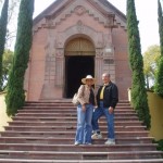
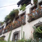
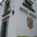
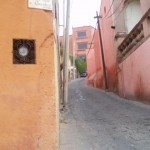
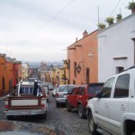
Day 16 started in Querétaro, but finished in a much smaller town called San Miguel de Allende. Now… HERE is a place that you can really relax in :) if Querétaro was small in comparison to Mexico DF, then San Miguel was tiny! It’s built on a hill… and is the quintessential Spaish-influenced Mexican village. Cobblestone streets, spanish villas, narrow alley ways, town square… all very traditional – and quite popular with european tourists. We didn’t do much there… basically just relaxed and soaked in the atmosphere. But we did get some great ideas for some spanish-inspired house decorating… stay tuned!

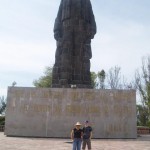
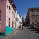
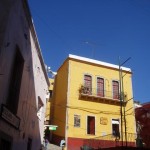
Day 17 we left San Miguel for Guanajuato. About an hour (?) from San Miguel, Guanajuato is the capital of the state Guanajuato, and is another village steeped in Mexican history and is also home to some awesome architecture, a million museums, and Diego Riviera’s childhood home. And we were there for a day…

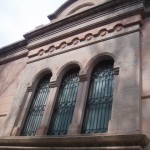
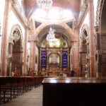
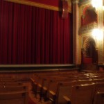
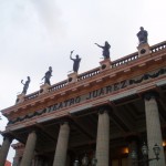
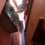
Suffice it to say we didn’t get enough time to look around the entire place. We did, however get to experience some of it’s highlights, including the towns’ concert hall (stunning in detail and opulent in production), a museum telling the story of Guanajuato’s importance in the move for Mexican Independence (from the Spanish), and a place called Kissing Alley – where apparently a young man and woman lived (on opposite sides of the alley) and who’s hoses were close enough that they could lean out over their balconies and kiss each other. How romantic.

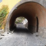
Another interesting thing about Guanajuato is that it is one of the main mining areas of old Mexico, and as such, the town has many old mining tunnels, which have been converted into streets! So now instead of driving around the hills to get to downtown, you simply take a tunnel through the hills!! Very cool – just don’t breath in the fumes whilst driving through…

Day 17, and we headed over to Leon – THE shoe capital of Mexico. And I mean that literally. Leon is in a flatter area of central Mexico, and is a city – bigger than Guanajuato.. it feels like the size of Wollongong I guess… anyway, as we are driving into it, Ailin tells me “This place has got lots of shoes”. I think, OK, a shopping complex that sells shoes…

No. Leon is a CITY that sells shoes!!! Imagine the sydney fish markets, then multiply it by 50, then swap all the fish with shoes, and you begin to get the picture. It is Ailin heaven :) We stayed there for a good 3 hours… and I didn’t find any shoes I liked!! Well, I found a few, but they either didn’t fit correctly, or weren’t in my size. But boy, were they cheap :)

If you like leather goods, especially shoes… make a beeline for this city – it’s about 4 hours out of Mexico DF by car, but you could fill a suitcase with stuff if you wanted to. Ailin did!

So, shoes, belts and bags bought, we hopped back in the car and headed for home – Mexico DF. Turns out Leon was about 30km from the dead center of Mexico, I really have to get a better handle on the geography of the place cause in the 17 days we’d been in Mexico we went through no less than 8 states, and swung around from far west to central north, central east, and dead center. It’s a big place (did I mention that?!)

We arrived at the outer limits of Mexico DF after a very scary 3 hour freeway trip. It’s not so much that the other drivers were bad – it was just that the sun was setting, and along much of the freeways there are capital works going on to increase road capactiy, and none of it is very well sign-posted, so at dusk it makes things very hard… especially when the work that is going on is in the fast lane!!!

Anyway, we made it to the outskirts… but then we hit rush hour (at 8:30pm), and we then had another 3 hour wait in a crush of traffic the likes of which I have never seen before in my life. It was just outrageous. Every street, every intersection, blocked.

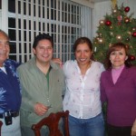
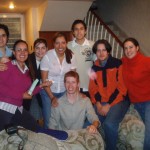
So busy, that we arrived 1.5 hours late for our Last Supper with Ailin’s family. Was sooo glad to get there in the end. And we eventually got to have a very traditional Mexican christmas dinner, where we played silly games, drank, and ate a dish called Bacalau. It’s fish-based, and Ailin’s uncle, who had only just arrived back in Mexico the day before, put in a huge effort to prepare it for us the previous night, and it didn’t dissapoint!

It was fantastic to catch up with her cousins and uncle and aunty, they are really great people, and very welcoming. Her siblings were there as well, and we were able to say our goodbyes and at last make our way back to Ailin’s friends’ house (Dari y Ceja) where we packed our bags and fell asleep (at 2am) for the last time on this trip. We woke at 4am (yes… 2 hours sleep) and headed off to the airport… and well, I won’t bore you with our next 34 hours… but lets just say we couldn’t have arrived soon enough!

So… that’s Mexico 2006. We enjoyed it, and hope you did too! Mery Christmas and Happy New Year!!