Online news done the right way

If you haven’t had a chance yet, go check out the redesign of ABC news. It is a shiny example of what can be achieved when you embrace some of the cool new HTML/CSS/Javascript techniques, while maintaining accessibility and increasing useability.

Even better, it doesn’t have banner ads.. (yet). Oh but it’s pretty!! Homepaged already.

EDIT – Also noticed that ABC news has it’s own twitter feed : http://twitter.com/abcnews/, and that RSS feeds from the site are totally customisable (if you like), based on your keywords.
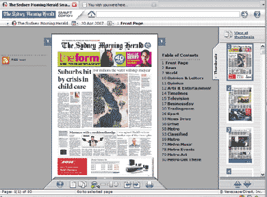
Read the newspaper online… literally

SMH.com.au has started showing the entire print version of their daily newspaper online : SMH News Paper Direct.

online paper
Screenshot taken from smh.newspaperdirect.com

Im not sure what I think of this idea yet – mainly I think it’s a waste of time, but there are parts that could be good from an accessibility point of view. Like the ability to hear an audio transcript of a story… but surely screen readers et al can do this for the existing website?

It was also pointed out to me that producing this type of online version is reasonably easy for them to do – in that they would have the paper in roughly this format already… but does easy make it useful? Not sure about that…

EDIT : ive had a little bit more of a play with it.. and there are a few cool things it can do – like translating content to various languages, skipping through content in a “webby” kind of way… but again, surely this is all done with the existing site? I guess the only thing I really like about it is that there are no banner ads!! Anyway…